From Overwhelming Data to Clear UX: Building the Bodymetrics MVP
Sole designer on a body-mapping platform focused on reducing friction, guiding users through sensitive data, and designing scalable, accessible UI components.
- Role: Product Design Intern
- Timeline: Feb–June 2025
- Focus: Mobile-first MVP · Onboarding · Insights · Design System
- Location: Bodymetrics (London)
- Tools: Figma · Miro
- Team: Weekly design reviews with the Chief Product Officer

Overview
I designed the first version of a mobile-first MVP for Bodymetrics, a tech-fashion platform that helps users engage with their body data in everyday contexts. I worked as the sole designer on the project, from early UX flows to scalable UI components. Bodymetrics is creating a platform that blends body measurement data with personalised digital experiences. I joined during the first phase, focused on building trust and clarity into the MVP’s onboarding and insights interface, laying the foundation for future features like AI styling recommendations. I worked directly with the Chief Product Officer to define the early UX direction and visual language.
Challenge
Bodymetrics was preparing to launch its first mobile MVP; a
smart body-mapping platform that blends biometric data with
future AI styling recommendations. To succeed, the product
needed to build early user trust, reduce onboarding friction,
and support clear interaction with sensitive personal data.
My challenge was to design an onboarding and insights
interface that felt intuitive, inclusive, and scalable;
especially for first-time users unfamiliar with body scanning.
This meant turning raw data into calm, mobile-first
experiences while laying the UX foundation for the company’s
upcoming AI roadmap.
Business Question:
"How might we increase user trust and onboarding completion
to support our AI styling roadmap?"
These objectives guided my initial research into existing
fashion-tech and body-mapping solutions.

● Highlights
25%
Fewer steps in core flows
Reduced onboarding from 8 to 6 steps without losing clarity
28
Wireframes created
Across onboarsding, measurments and body map flows.
10
Reusable UI components
Scalable patterns for faster iterations + light/dark modes to improve accessibility
● Research & Discovery
Research Goal: Identify early UX opportunities for a mobile-first body-mapping MVP by reviewing competitor approaches and mapping the expected user journey, with a focus on clarity and trust. We also considered accessibility from the start.
Target Users: While the app was designed to be used by all genders, early market analysis suggested the strongest appeal would be among fashion-lover users, especially young women, who value accurate fit and styling advice.
Scenario: A user opens the Bodymetrics app for the first time to prepare for an online clothing purchase. They complete a body scan, then view their measurements and receive tailored styling recommendations.
These insights shaped the onboarding and insights flows I focused on in the design phase.
Approach:

Competitive Analysis Key Insights
- Overwhelming Data Presentation: Competitor apps often presented raw data without context, causing confusion
- Lack of Personalisation Signals: Styling suggestions often feel generic, not tailored to the user’s profile or body shape, reducing trust in recommendations.
- Cluttered Onboarding Flows:Feature introductions often happen all at once in long carousels, which users skip.
User Journey Map
I met weekly with the CPO to align UX decisions with product
goals and user needs.
Key Takeaways:
- Clarity > complexity
- Guide users through unfamiliar data
- Build trust through tone, structure, and consistency

● Design Process
Design Strategy
I prioritised the onboarding and insights flows first, as research showed these moments were critical for building trust and reducing early drop-off. Accessibility and scalability were built into the design system from the start to ensure consistency as the product evolved.
Decision-Making in Action
- Progressive Disclosure: Limited initial data shown on insights screens to prevent cognitive overload, with clear links to detailed views.
- Trust Cues in Onboarding: Added plain-language explanations and privacy icons to address concerns observed in competitor analysis.
- Design System Efficiency: Created 10 reusable components to reduce build time and maintain consistency across future releases.
Outcome
This strategy resulted in a scalable, accessible MVP foundation that reduced task steps by 25% (after 2-3 round of itterations for each section) and supported a smooth handover for future feature expansion.
User Flow
Low-Fidelity Wireframes
Once the flows were validated internally, I translated them into a scalable design system to support future product growth.
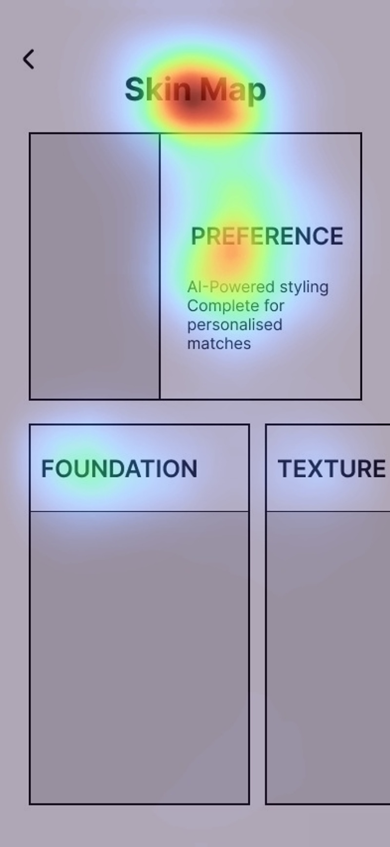
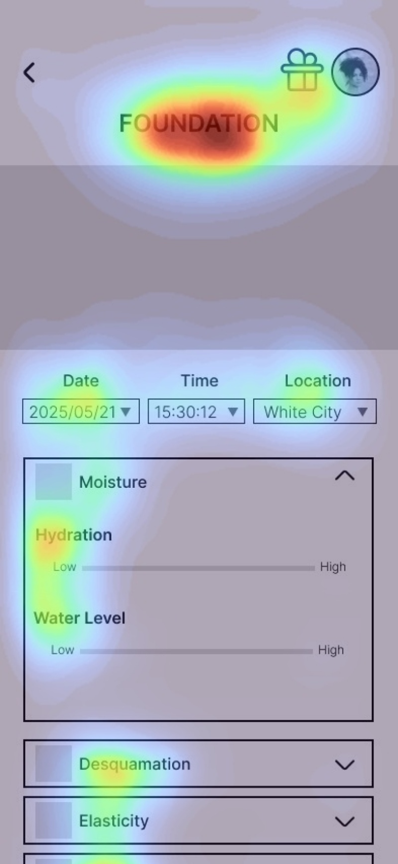
Validation & Heatmap Analysis
To validate the clarity of my wireframes, I ran an early
heatmap analysis simulating user attention across key screens.
This helped me confirm that primary navigation elements,
headings, and action prompts were drawing focus where
intended. The results guided small adjustments in hierarchy
and spacing to improve scannability before moving into
high-fidelity design.
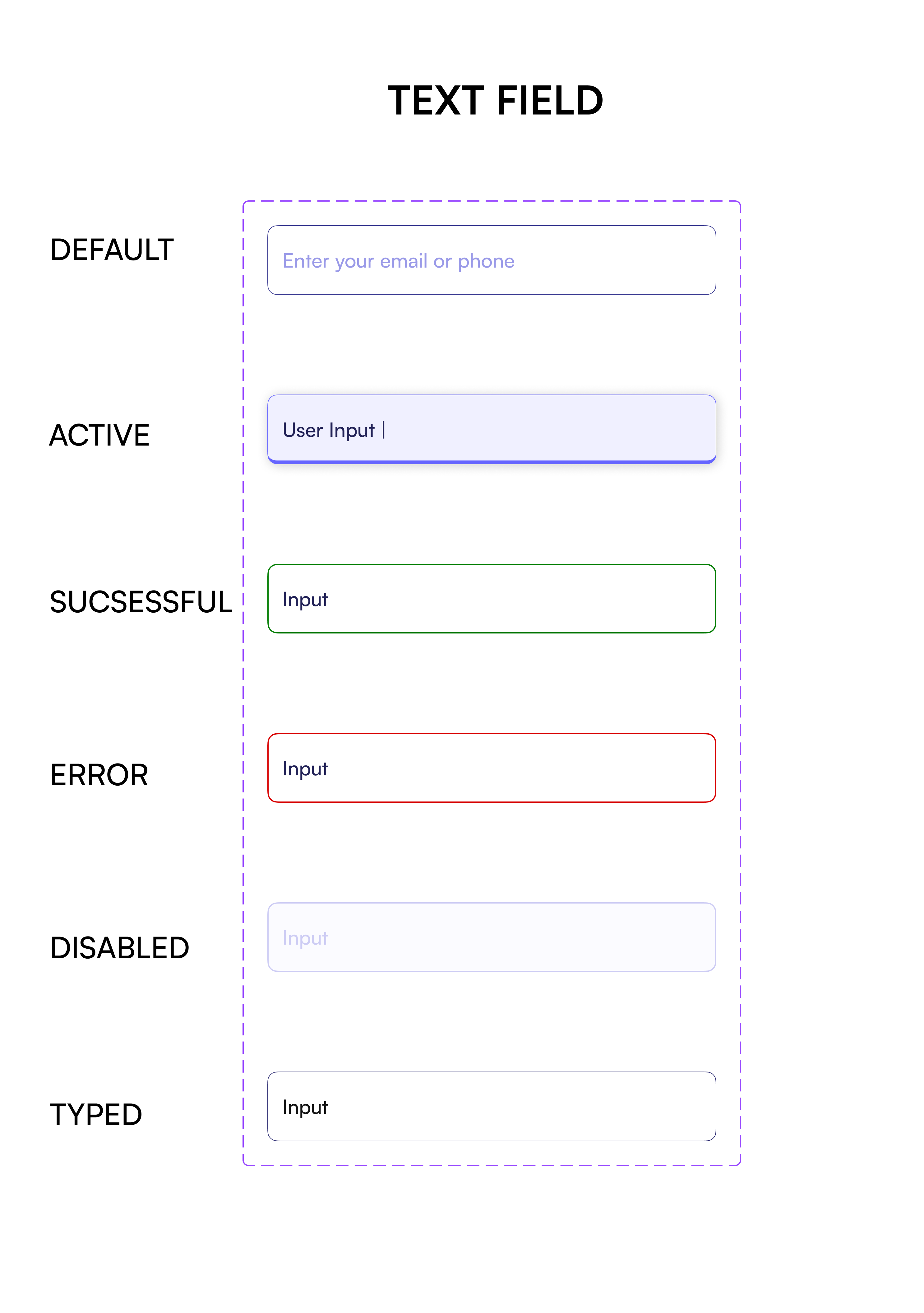
Design System:
Scalable, Accessible UI System for MVP Growth
Built a reusable Figma system with 10 core components, dual light/dark palettes, and responsive typography styles; enabling faster iteration and consistent UI across all MVP flows.
Key Features:
- Core Components: Buttons, form fields, cards, navigation, and data visualisation modules
- Colour Palettes: High-contrast light and dark themes (WCAG AA compliant) with accessibility baked into components, e.g., clear field labels for screen readers and tap-friendly button sizing
- Typography: Responsive type scales for mobile-first layouts
- Interaction States: Hover, focus, and tap targets optimised for touch devices
- Spacing & Grid: 8px-based layout grid for visual harmony across screens
Core UI components for consistent interaction patterns
Accessible form states
Scalable Button Varients
Categoty cards for Body data
High-contrast palettes for legibility in all lighting conditions
Accessibility-First Design Approach
Accessibility wasn’t a final checklist; it was embedded from the first wireframes through to the final UI, ensuring the MVP was comfortable, inclusive, and easy to use for as many people as possible.
Key Principles Applied:
- High-contrast colour palettes for legibility in both light and dark environments
- Tap targets sized for comfort on mobile devices and for users with reduced dexterity
- Clear hierarchy and labelling to reduce cognitive load and guide navigation
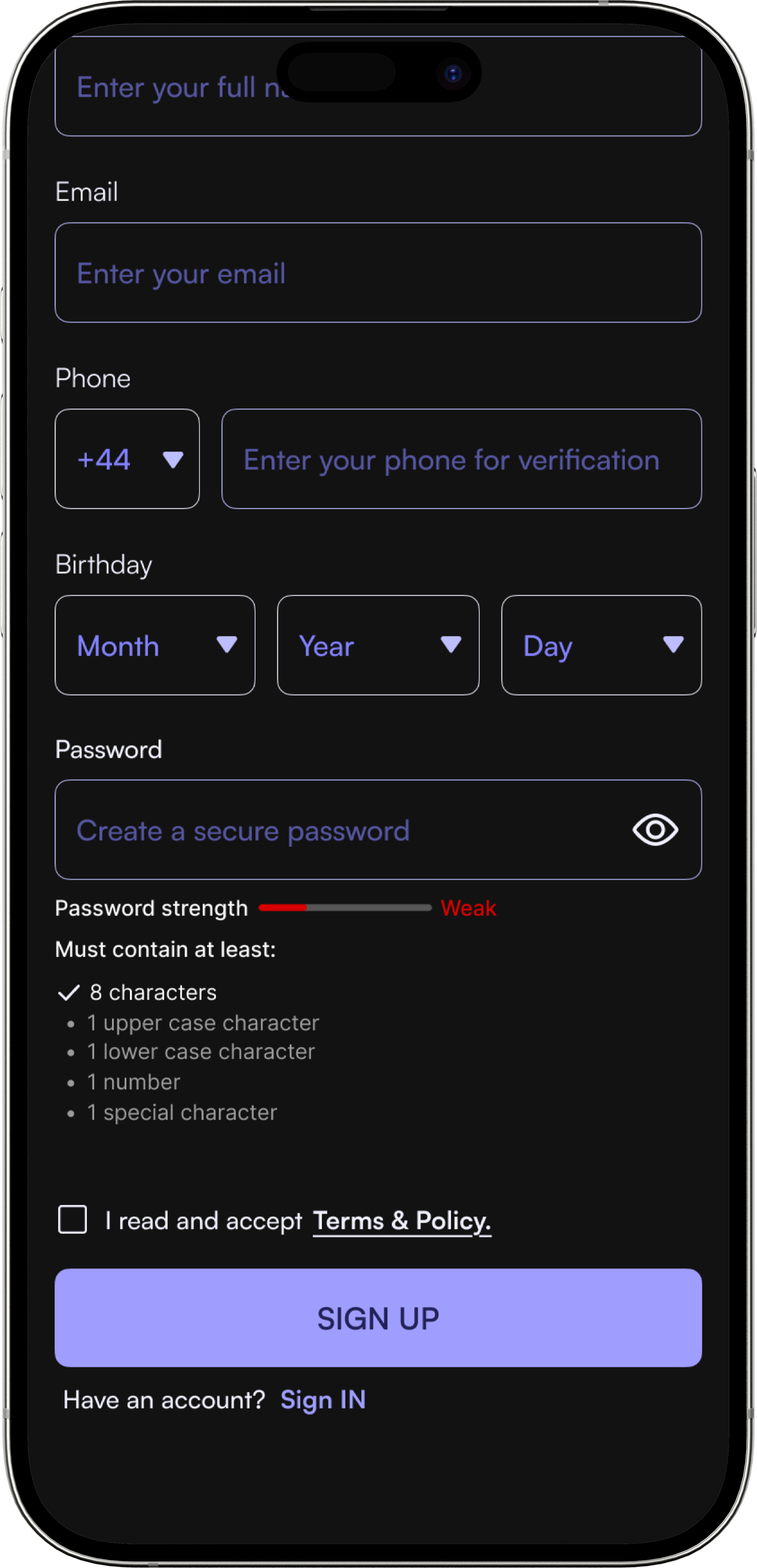
- Meaningful form field labels (e.g., using “Enter your full name” instead of “Name”) to improve clarity and screen reader compatibility
Impact
These decisions created a calmer, more predictable experience and ensured the MVP met WCAG AA accessibility standards while making the interface more welcoming for users of all abilities.
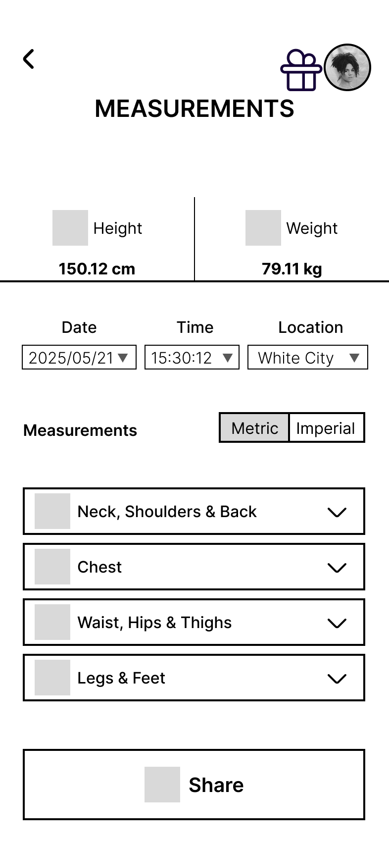
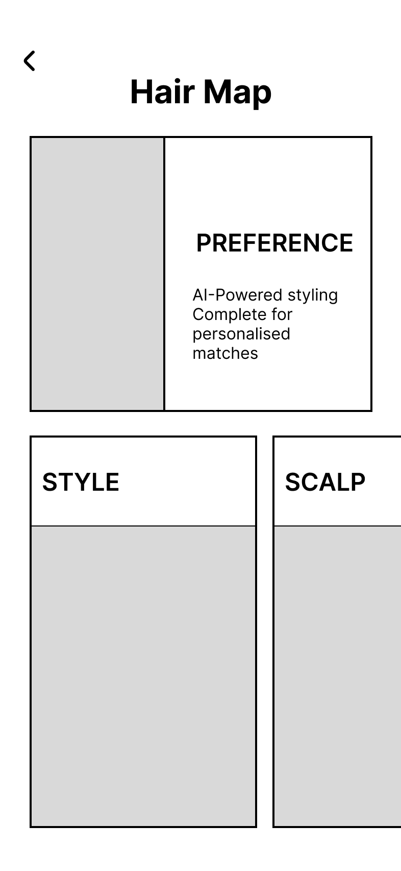
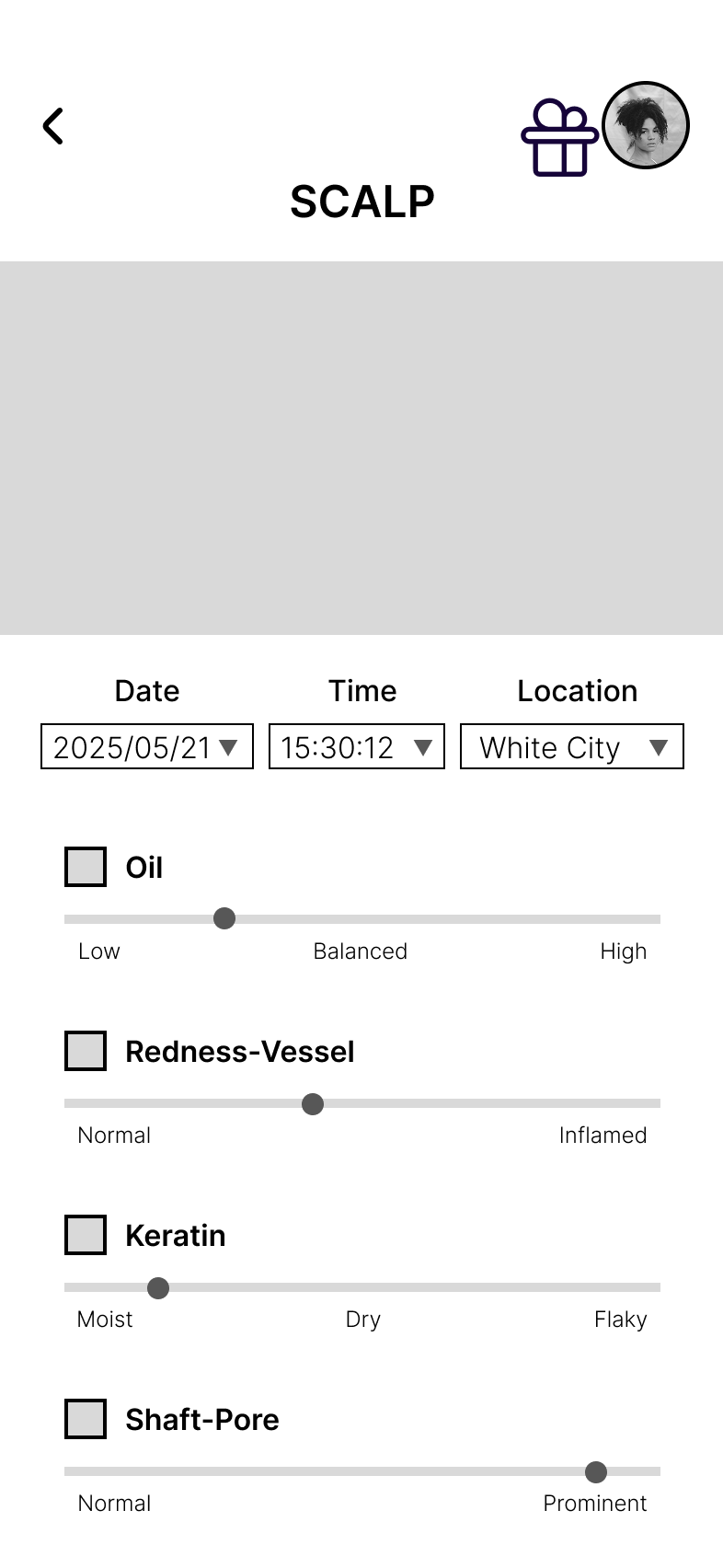
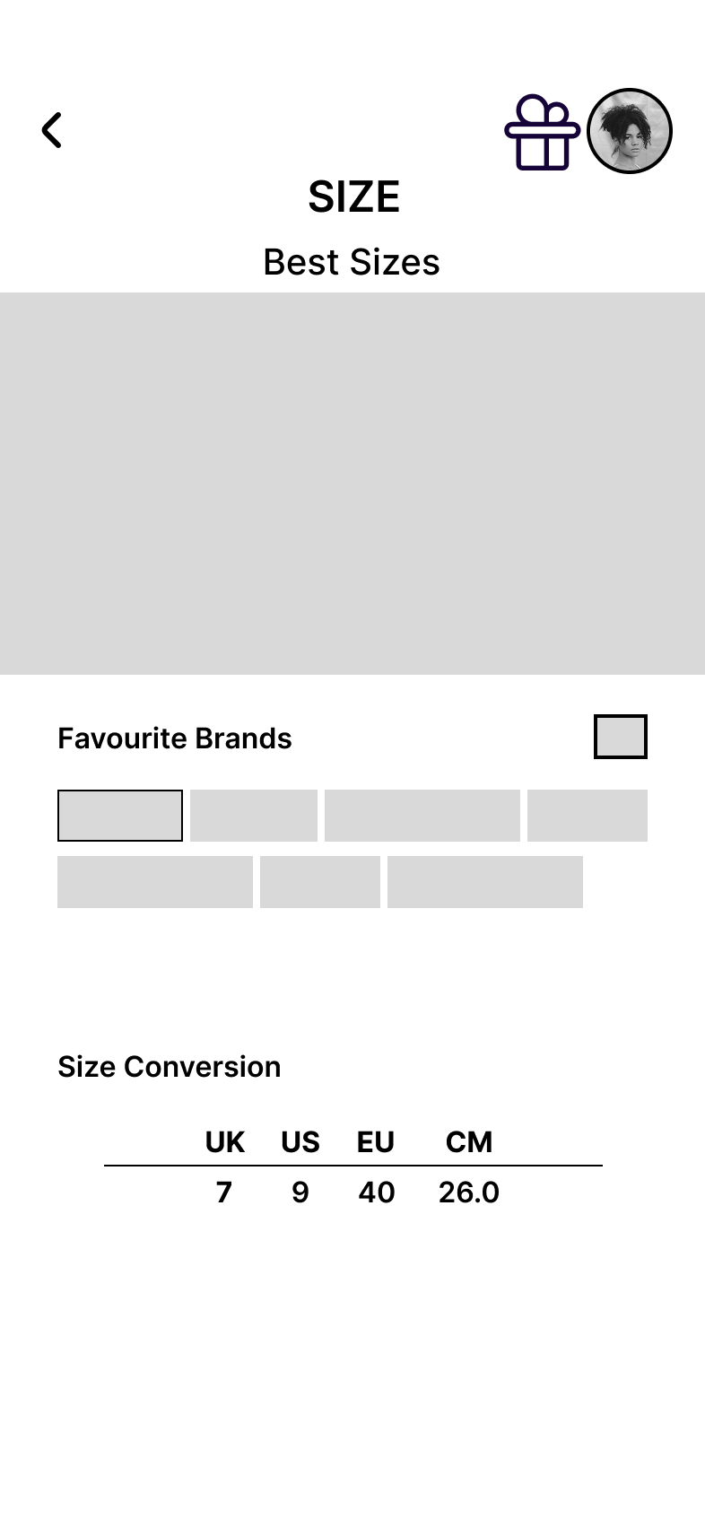
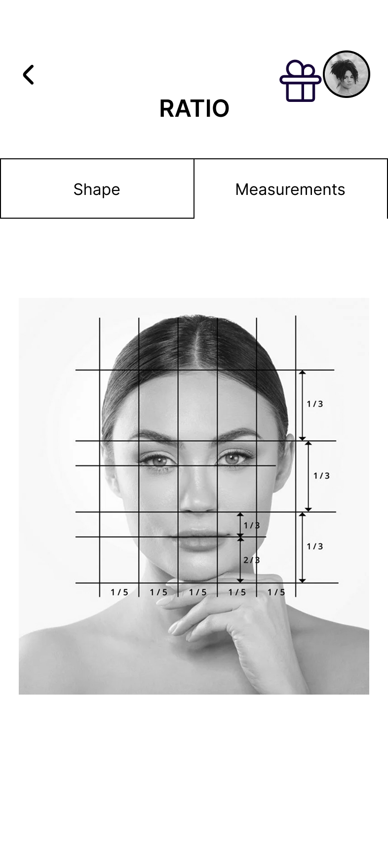
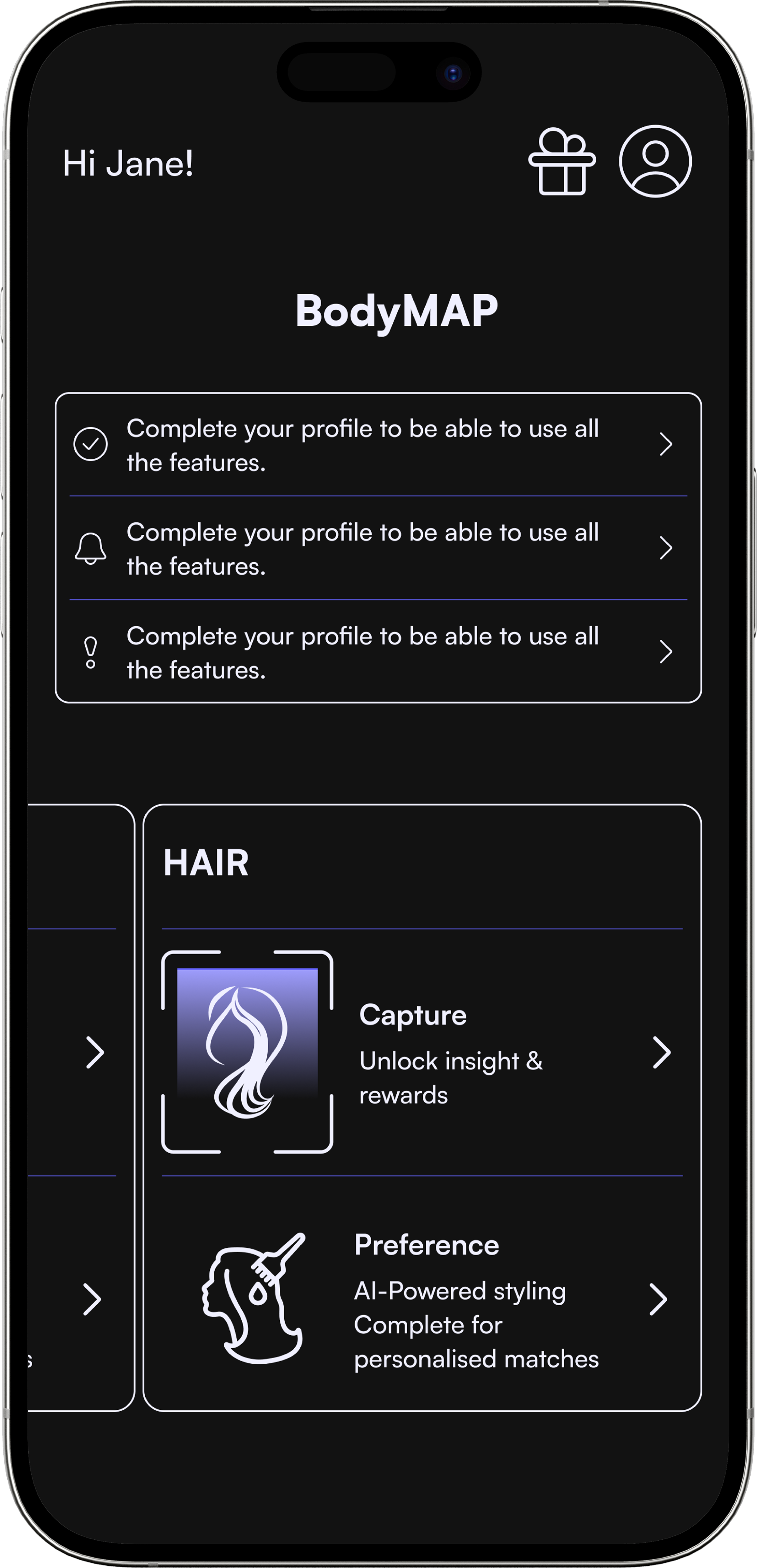
● Final UI: Clarity, Trust, and Accessibility in Action
These high-fidelity screens demonstrate how the MVP’s onboarding and insights flows integrate the design system, accessibility principles, and trust-building features developed earlier.
High-Fidelity Wireframes
Note on NDA
Due to confidentiality agreements, only selected screens are shown here. These examples highlight core design patterns and UI decisions. Additional flows can be discussed in person during interviews.
The early wireframe prototype was used to map the core onboarding and insights flows before visual design.